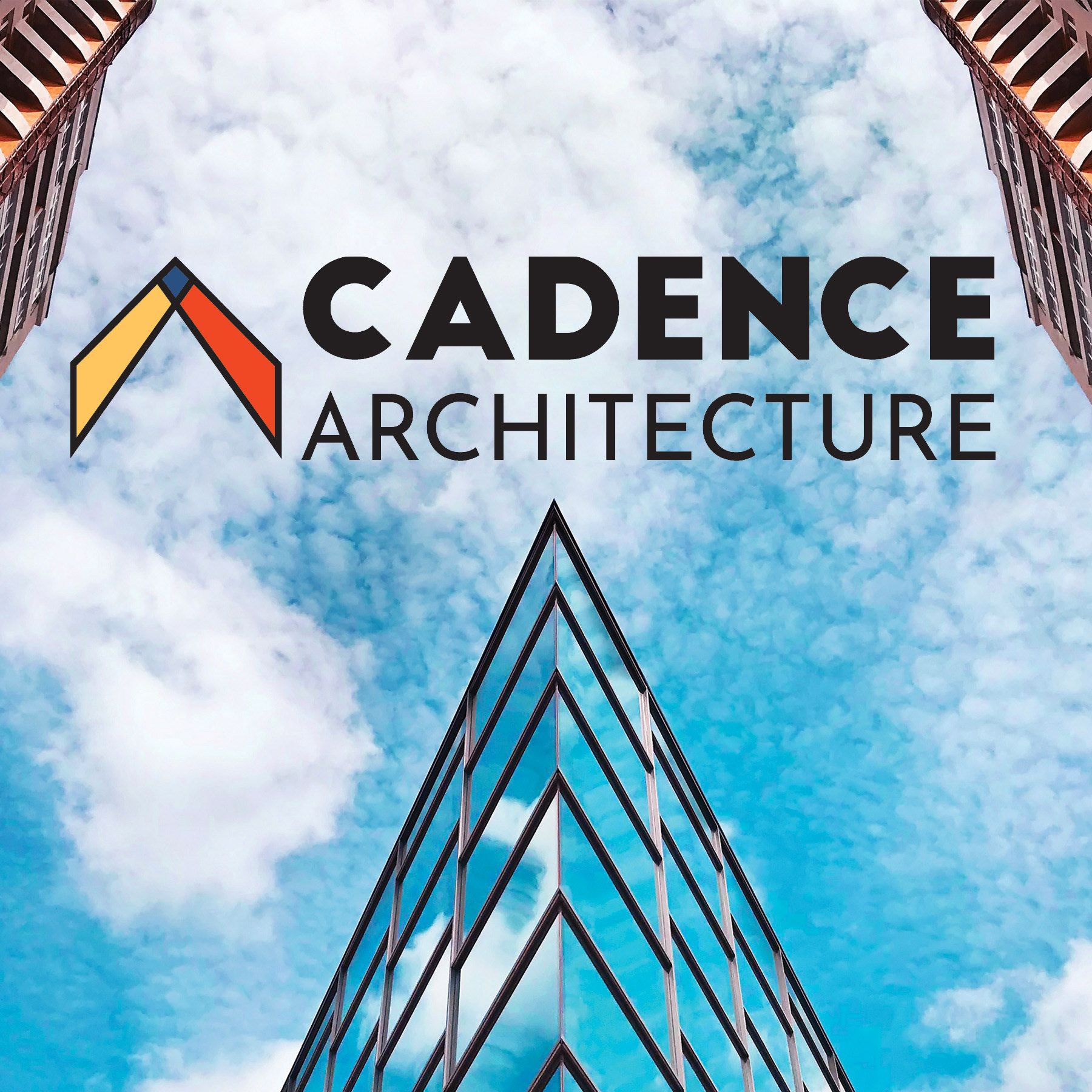
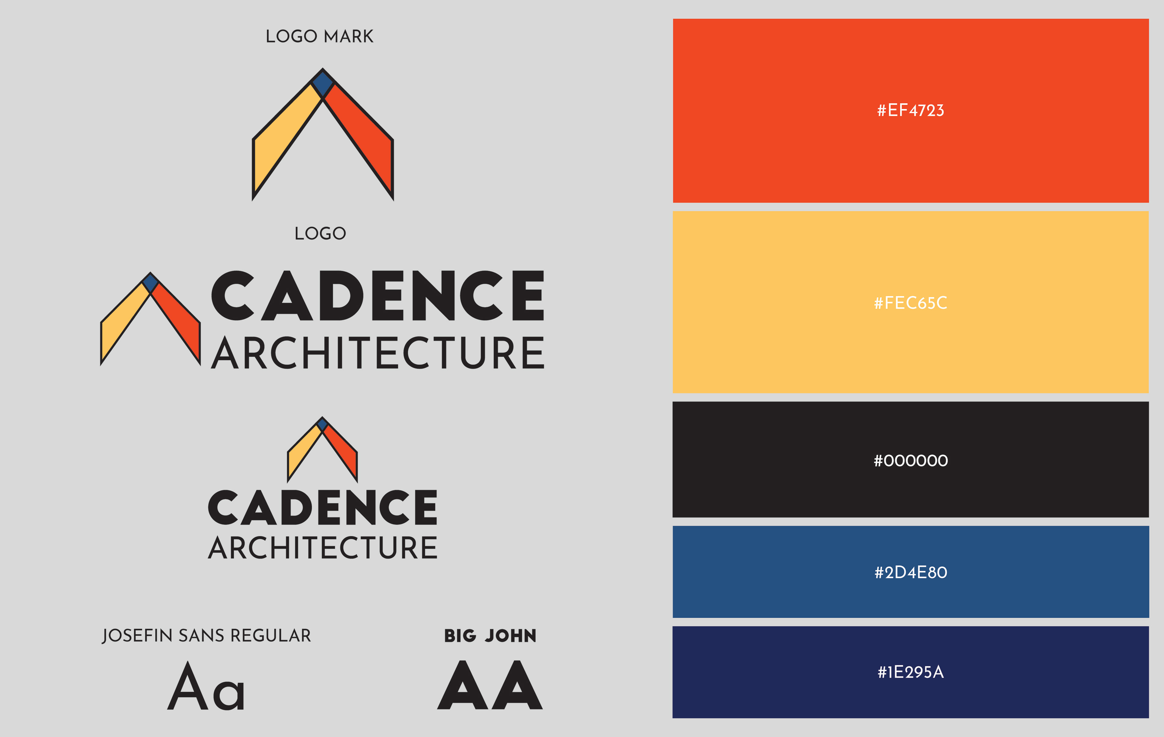
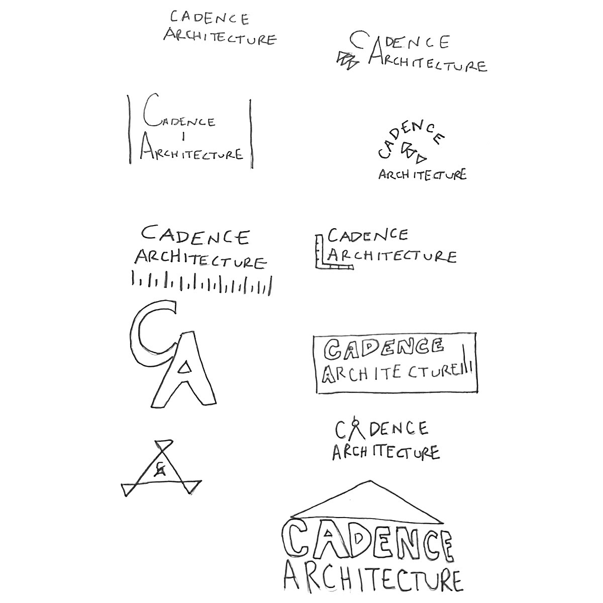
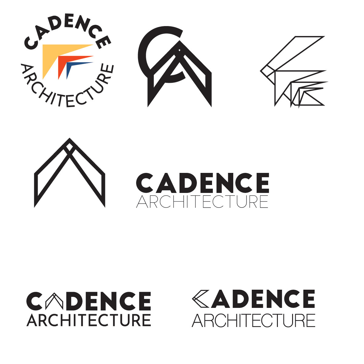
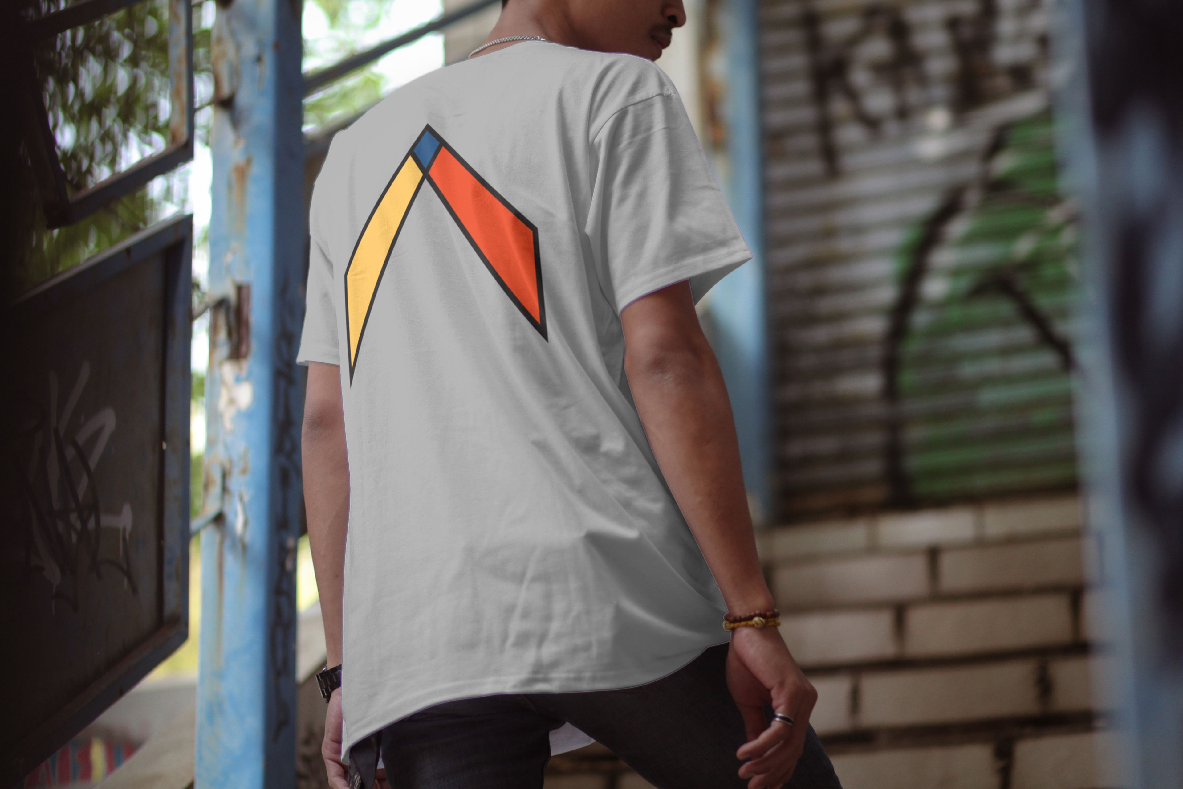

The goal was to take their old logo and give it a refresh. Their colors were too bright and the word 'ARCHITECTURE" got lost when scaled down. I created a color palette that was much calmer and created a shape for the logo that is part of a geometry model the company uses. This logo is meant to feel strong, powerful and trustworthy with the symbol not only being something they use but also point upward like an arrow giving the idea of moving forward.